
ここからコンテンツです。
Universality observed in preference for color composition in paintings
Color compositions that artists find beautiful are also beautiful to the viewer Shigeki Nakauchi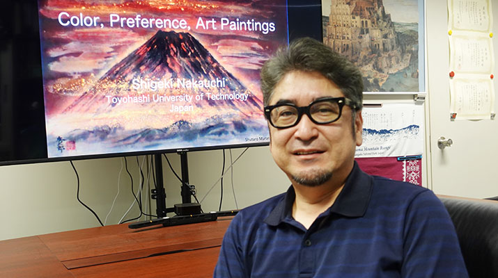
Professor Shigeki Nakauchi's research team at Toyohashi University of Technology worked with researchers from the University of Minho (Braga, Portugal) to examine preferences for color composition of Japanese and Western paintings among Japanese and Portuguese subjects through experiments using the original paintings and fake versions with artificially altered color compositions. The results showed that many people preferred the color scheme of the original painting even if they had never seen it before, regardless of nationality, whether the painting was Japanese or Western, figurative or abstract, and that this tendency was also observed for images created by assembling several different paintings in a patchwork fashion. The universality in preference for color composition in paintings found in this study suggests that the "beauty" we perceive in paintings may have a common biological basis, which goes beyond cultural background or educational experience.
Color is one of the visual elements that has the most influence on personal preference. For example, it has a major influence on a person's decision-making process when selecting clothing or imagining a company's character from the company's logo. Product designers are well aware of the effect color has on consumer behavior and work to maximize its effect. There are even professional organizations that predict color trends.
The importance of color is no less significant with paintings. Artists attempt to express their personal aesthetic experience unless there is a commercial reason to do otherwise. As a result, it can be said that the color composition of paintings simply reflects the artist's sensibilities and preferences for color. Ample research has been conducted on color preference, but preferences vary widely among individuals, and most studies have focused on a single color. For this reason there has been little progress in gaining a scientific understanding of preferences for a balance or harmony of many colors (color composition) such as is found in paintings.
To clarify preferences for color composition in paintings, this study rotated the hue of each pixel counterclockwise around the average color, so that only the colors were changed while the spatial composition and lightness of the paintings remained the same (Figure 1). Although the interrelationships among the colors in the painting and the average vividness of the colors remain unchanged from the original, the impression of the color scheme of the painting is markedly altered by such manipulations. We prepared images by rotating the color hue by 90, 180, and 270 degrees counterclockwise, and alongside the original, asked participants which of the four had the most pleasing color composition (four-alternative forced choice). For the experiment, 40 paintings were prepared, of which 20 were Western and Japanese paintings photographed in Portugal and Japan (Toyohashi City Museum of Art and History) and the remaining 20 were taken from art galleries on the internet. 90 people from Japan and 45 people from Portugal participated in the experiment. Participants had not received any special education in art.
From the results of the experiment, we discovered that around 70% of both Japanese and Portuguese participants preferred the color composition of the original painting the most, even for paintings that they had never seen before (dropping to 25% when they chose at random). This trend was the same for abstract painting depicted without objects associated with a specific color, for example the sky or human faces.
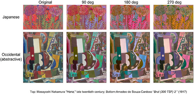
The color hue was rotated counterclockwise around the average color without altering spatial composition or lightness. The impression of the color composition in the paintings was greatly altered, while the lightness, average color, and the relationship between colors remained unchanged. Around 70% of the participants preferred the original painting the most, even for paintings that they had never seen before. Top: Masayoshi Nakamura "Hana," late twentieth century, housed at the Toyohashi City Museum of Art and History; Bottom: Amadeo de Souza-Cardoso "Brut (300 TSF) 2 " , 1917, public domain, source: WikiArt (http://wikiart.org)
Similar experiments were also conducted on images created by dividing a painting into smaller pieces and shuffling the positions of the pieces so that it was difficult to determine what was depicted in the painting, as shown in Figure 2, and on images created by assembling portions of 20 paintings together like a patchwork. We discovered that about 60% of participants favored the scrambled painting of the original painting or the color composition of the patchwork painting of original paintings the most.
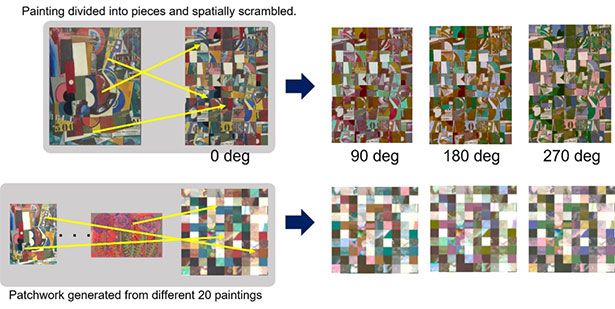
We examined preferences for color composition of paintings where the original painting was divided into pieces which were scrambled, as well as for a patchwork image made from pieces of 20 different paintings, and carried out the same experiment. We discovered that about 60% of participants favored non-rotated color compositions the most.
These results indicate the following:
- The color compositions that the participants chose according to their own preferences matched those of the painters' drawings, suggesting that the painters and the general public share a certain level of standards for the attractiveness or beauty of color schemes, despite differences in art education and cultural backgrounds.
- The fact that the original painting is still preferred even after shuffling indicates that some information indicating the originality of the painting exists in the color composition itself, rather than the memory color being a clue, such as the depiction of objects that remind us of a particular color.
- The fact that the original color scheme was preferred over the patchwork of original paintings suggests that paintings by completely different artists have some common features, and that there is a biological mechanism by which both painters and observers perceive them as beautiful (attractive), whether they are aware of it or not.
The research team believes that everyone has a mechanism for perceiving the attractiveness and beauty of color compositions, and that these characteristics may be surprisingly common to all people. By clarifying the mechanisms behind such decisions, we hope to answer questions such as what factors influence beauty, which is considered to be an extremely personal and subjective entity, and why humans are equipped with the mechanisms to perceive beauty in the first place.
Measurements of Japanese paintings were carried out in cooperation with the Toyohashi City Museum of Art and History. This research received the following support: JSPS KAKENHI Grant Number JP19H01119 and 20H05956 and the Portuguese Foundation for Science and Technology (FCT) in the framework of the Strategic Funding.
Reference
Shigeki Nakauchi, Taisei Kondo, Yuya Kinzuka, Yuma Taniyama, Hideki Tamura, Hiroshi Higashi, Kyoko Hine, Tetsuto Minami, João M. M. Linhares & Sérgio M. C. Nascimento, Universality and superiority in preference for chromatic composition of art paintings. Scientific Reports 12, 4294 (2022).
https://doi.org/10.1038/s41598-022-08365-z
絵画配色の好みに見られる普遍性
画家が美しいと感じる配色は見る人も美しいと感じる中内 茂樹
豊橋技術科学大学 中内茂樹教授の研究チームは、ミーニョ大学(ポルトガル・ブラガ)の研究者らと協力して、日本人とポルトガル人を対象に、日本画と西洋画の配色に対する選好を原画および配色を人為的に操作した偽の絵画を使って実験的に調べました。その結果、国籍や日本画と西洋画、具象画と抽象画の違いによらず、見たことが無い絵画に対しても多くの人が原画の配色を好むこと、またこの傾向は複数の異なる絵画をパッチワーク状に寄せ集めて作った画像に対しても見られることを明らかにしました。今回発見した絵画配色に対する選好の普遍性は、私たちが絵画に対して感じる「美しさ」が文化的背景や教育経験だけでなく、これらに依らない生物学的な共通基盤を有していることを示唆しています。
色は個人の好みに最も影響を与える視覚的要素の一つです。例えば、洋服を選ぶときや、ロゴマークから企業の性格を想像するときなど、色は人の意思決定に大きな影響を与えます。プロダクトデザイナーは、色が消費者行動に与える影響をよく理解し、その効果を最大化するために活動しており、色のトレンドを予測する専門機関も存在するほどです。
色の重要性は絵画においても同様です。商業的な理由がない限り、画家は自分の個人的な美的経験を作品として表現しようとします。したがって、絵画の配色は純粋に画家の感性や色彩の好みが反映されたものと言えます。これまで、色に対する選好(好み)に関して多くの研究がなされてきましたが、好みは個人間の差異が大きく、また単一の色に対する研究がほとんどであったため、絵画などのように、多くの色のバランス(配色)に対する選好の科学的理解は十分には進んでいませんでした。
本研究は、絵画配色に対する選好を明らかにするために、絵画の空間構成、明度は変化させず、色だけを変化させるように、平均色を中心に各画素の色相を反時計回りに回転させました(図1)。こうした操作によって絵画に含まれる色の相互関係や、平均的な鮮やかさなどは原画からは変わらないものの、絵画配色に対する印象が大きく変化します。この操作によって、90度、180度、270度色相を回転させた画像を用意し、原画を含めた4種類の画像に対して最も好きな配色を参加者に尋ねる実験を行いました(4肢強制選択法)。実験には、ポルトガルおよび日本(豊橋市美術博物館)において撮影した西洋画および日本画合計20作品、およびインターネット絵画ギャラリーから入手した20作品、合計40作品の絵画を用い、それぞれ日本から90名、ポルトガルから45名が実験に参加しました。なお、実験参加者は芸術や美術について、特別な教育は受けていませんでした。
実験の結果、日本人もポルトガル人も、それまで一度も目にしたことがない絵画に対しても、およそ70%の参加者が原画の配色を最も好むことがわかりました(もし、ランダムに選んでいたならば、25%となります)。この傾向は、空や人の顔など、特定の色と結びつくような物体が絵画に描かれていないような、抽象画の場合でも同様でした。
また、図2に示すように、絵画に描かれている内容が分かりにくくなるよう1枚の絵画を小片に分割し、その位置をシャッフルした条件や、20枚の絵画の一部をパッチワークのように寄せ集めて作った画像に対しても同様の実験を行ったところ、約60%の参加者が原画をシャッフルしたもの、あるいは原画を継ぎはぎしたパッチワークの配色を最も好むことがわかりました。
これらの結果から、次のようなことが示唆されました。
- 実験参加者が自分の好みにしたがって選んだ配色が、結果として画家の描いたものと一致したということは、美術教育の有無や文化的背景の違いにも関わらず、配色の魅力あるいは美しさに対する基準が画家と一般人の間で一定程度、共通している。
- シャッフルしても原画が好まれることから、特定の色を連想させる物体が描かれているなど、記憶色が手がかりとなったのではなく、配色そのものに原画らしさを示す何らかの情報が存在する。
- 原画をパッチワーク状に継ぎはぎした画像に対しても原画配色が好まれたことから、全く別の画家が描いた絵画にも何らかの共通した特徴が存在しており、それらを画家も観察者も、意識する・しないに関わらず、美しさ(魅力)として感じる生物学的な仕組みが存在する。
研究チームは、配色の魅力や美しさを感じるメカニズムは誰にでも備わっていて、その特性は意外と人に共通であろうと考えています。SNS等の写真に「良いね」と反応したり、衣服を選んだり、部屋の内装を決めたり、そうした意思決定の背後にあるメカニズムを明らかにすることで、極めて個人的で主観的な存在と考えられている「美しさ」について、どのような要因が美しさに影響を与えているのか、そもそもなぜ美しさを感じる仕組みが人間に備わっているのか、そうした問いに答えていきたいと考えています。
日本画の計測は豊橋市美術博物館のご協力により実施されました。また、本研究は次の助成を受けて行われました。科学研究費補助金(基盤研究(A)JP19H01119;学術変革領域研究(A)20H05956)、ポルトガル政府 科学研究費助成金(UIDB/04650/2020)。
Researcher Profile
| Name | Shigeki Nakauchi |
|---|---|
| Affiliation | Department of Computer Science and Engineering |
| Title | Professor |
| Fields of Research | Vision Science & Technology / Spectral Color Imaging |
| Graduated KOSEN | Takuma National College of Technology |
ここでコンテンツ終わりです。